Dylan K. Picart
An analysis of the trends of SARS-CoV-2 RNA concentrations in NYC wastewater during the height of the COVID-19 pandemic that uses API Building, SQLite for database creation, manipulation, and storage, Pandas & Matplotlib for data visualization and analysis, and scikit-learn for Linear Regression.
Introduction
The COVID-19 pandemic has presented unprecedented challenges globally. Among various methods to monitor the spread of the virus, formally known as SARS-CoV-2, wastewater surveillance has emerged as a reliable indicator of community infection levels. My project aims to predict SARS-CoV-2 RNA concentrations in NYC wastewater using historical data and linear regression models. The project involves building an API, processing data with SQL, and developing a machine learning model to make accurate predictions. This article outlines the processes, techniques, and insights gained from the project.
Hypothesis
The hypothesis driving this project is that SARS-CoV-2 RNA concentrations in NYC wastewater can be accurately predicted using a linear regression model based on historical wastewater data and related variables. Given the relationship between the virus’s presence in wastewater and the number of cases in the population, I expected that the model could serve as a valuable tool for public health monitoring and decision-making.
API Building
The project’s initial step involved building a REST API to handle and process the data. The dataset was obtained in JSON format, which needed to be converted into a workable database for further analysis. I incorporated extra steps in error handling to ensure proper requesting, as well as addressing potential server and/or user issues. Since the dataset was small (< 10,000 data points), I stored the JSON file on my system.
import os
from requests.exceptions import ConnectionError, HTTPError

def fetch_and_store_json(url: str, json_data: str, endpoint: str, params=None):
    """
    Fetches JSON data from the given API URL and stores it in a file. If the file already exists,
    it loads the data from the file instead of making an API request.

    Parameters
    ----------
    url: str
        The API URL to fetch data from.
    json_data: str
        The file path to store the JSON data.
    endpoint: str
        The API endpoint to be appended to the base URL.
    params: dict
        Optional parameters to include in the request.

    Returns
    -------
    data: list(dict)
        The JSON data loaded from the file or fetched from the API,
        or None if an error occurs.
    """

    # Check if the file already exists locally
    if os.path.exists(json_data):
        print(f"File '{json_data}' already exists. Loading data from the file...")
        try:
            with open(json_data, 'r') as file:
                data = json.load(file)
        except (json.JSONDecodeError) as e: # In case the JSON format is invalid
            print(f"Error loading JSON data from file: {e}")
            data = None
    else:
        print("File not found. Making an API request...")
        try:
            # Make the API request
            r = requests.get(f"{url.rstrip('/')}/{endpoint.lstrip('/')}", params=params) # strip to remove potential extra slashes
            r.raise_for_status()  # Raise an error for bad status codes
            data = r.json()  # Decode the JSON response

            # Save the JSON response to a file
            with open(json_data, 'w') as file:
                json.dump(data, file)

            print("API request successful.", r.status_code)

        except HTTPError as http_err:
            print(f'HTTP error occurred: {http_err}')
            data = None
        except ConnectionError as conn_err:
            print(f'Connection error: {conn_err}')
            data = None
        except Exception as err:
            print(f'Other error occurred: {err}')
            data = None

    # Return the JSON data
    return data

URL = "https://data.cityofnewyork.us/resource/"
json_data = 'cov_rna_api_data.json'

data = fetch_and_store_json(URL, json_data, endpoint='f7dc-2q9f.json', params={'$limit': 5754})

if data:
    print(f"Data loaded from file or API: {len(data)} records")
else:
    print("No data was returned.")
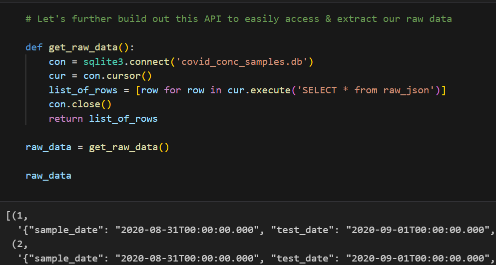
Converting JSON to a Workable Database
Using Python’s json library, I parsed the JSON data and used SQLite3 to create and manage a SQLite database. The code snippets below demonstrates how the JSON data was processed and inserted into a database:

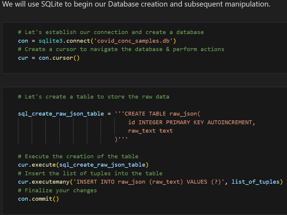

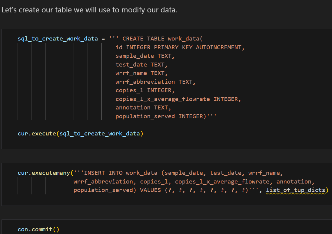
This setup allowed me to query and manipulate the data efficiently, setting the stage for further analysis. Additionally, I created a class SQLiteDB to streamline DataBase manipulation and querying with safety in mind.
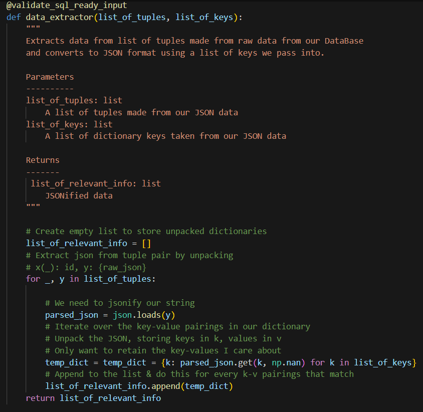
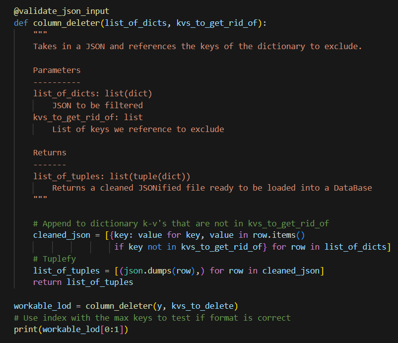
Helper Functions
To streamline the data processing, I developed several helper functions. These functions were crucial for tasks such as data cleaning, normalization, and feature engineering.
Example Helper Function: Data Normalization
One of the helper functions we can implement is for data normalization, ensuring that all features are on a similar scale. Below is an example of the code used:
def normalize_data(df, columns):
    for col in columns:
        df[col] = (df[col] - df[col].mean()) / df[col].std()
    return df
This function can be applied to the relevant columns in the dataset, standardizing the data for better model performance. However, since the data already has a normalized version of the data copies_l_x_average_flowrate, I will not be using this for the time being. Additionally, I will normalize the data in a different way later on in this post. I will, however, design helper functions to make SQL queries. The most important functions that were used I’ve included in the snippets below:
Helper Functions Used
# Helper function to select a specific location by month
def select_loc_and_mo(params):
  """Selects by WRRF abbreviation AND range by sample_date"""

  with SQLiteDB(db_file) as db:
    abv, start_date, end_date = params # Unpack params
    df = pd.read_sql_query("SELECT * FROM work_data WHERE wrrf_abbreviation = ? AND test_date BETWEEN ? AND ?;",
                           db.con, params=(abv, start_date, end_date))
    df['test_date'] = pd.to_datetime(df['test_date'])  # Convert test_date to datetime
    return df
To avoid SQL injections, we use (?), which represents an unnamed parameter which can be filled in by a program running the query.
The crux of this project was based on generating DataFrames with respect to time periods and locations. In order to utilize the above function efficiently, the following function was created.
def generate_location_and_time_dfs(params):
    """
    Generates a list of DataFrames for each location abbreviation within a specific date range.

    Parameters:
        abbreviations (list of str): List of location abbreviations.
        start_date (str): The start date in the format 'YYYY-MM-DD'.
        end_date (str): The end date in the format 'YYYY-MM-DD'.

    Returns:
        list: A list of DataFrames based on differing WRRF locations and identical time periods.
    """

    *abbreviations, start_date, end_date = params  # Unpack params

    with SQLiteDB(db_file) as db:
        # Use a list comprehension to create a list of DataFrames per abbreviation
        dfs = [
            pd.read_sql_query(
                "SELECT * FROM work_data WHERE wrrf_abbreviation = ? AND sample_date BETWEEN ? AND ?;",
                db.con,
                params=(abv, start_date, end_date)
            ) for abv in abbreviations
        ]

    # Convert test_date to datetime for all DataFrames, drop columns, and fix index
    for df in dfs:
        df['test_date'] = pd.to_datetime(df['test_date'])
        df.drop(columns=['id'], inplace=True)
        df.index = df.index + 1

    return dfs  # Return the list of DataFrames directly
# Display our original work table
def work_tables():
    """Loads a DataFrame directly from DataBase table using pd.read_sql_query."""
    with SQLiteDB(db_file) as db:
        query = 'SELECT * FROM work_data;'
        work_table = pd.read_sql_query(query, db.con)
    return work_table
def select_by_abv_loc(params):
    """
    Selects by Wastewater Resource Recovery Facility's abbreviated name.

    Parameters:
        params(tuple): Tuple containing WRRF abbreviated name to filter

    Returns:
        DataFrame: Filtered DataFrame with respect to WRRF facility
    """

    with SQLiteDB(db_file) as db:
          wrrf_abbrv = params
          df = pd.read_sql_query("SELECT * FROM work_data WHERE wrrf_abbreviation = ?;", db.con, params=(wrrf_abbrv,))
          return df
def select_by_test_month(params):
    """
    Selects a range by test_date and returns a filtered DataFrame.

    Parameters:
        params(tuple): Tuple containing start & end dates to filter

    Returns:
        DataFrame: Filtered DataFrame with test_date between start & end dates
    """

    with SQLiteDB(db_file) as db:
        start_date, end_date = params # Unpack params
        df = pd.read_sql_query("SELECT * FROM work_data WHERE sample_date BETWEEN ? AND ?;", db.con, params=(start_date, end_date))
        df['test_date'] = pd.to_datetime(df['test_date'])

        return df
For more info on how I implemented these functions, please refer to the GitHub repository linked below.
Visualization Insights
Data visualization played a crucial role in understanding the trends and relationships within the data. By plotting the SARS-CoV-2 concentration over time, I observed clear patterns that aligned with known pandemic waves.
SARS-CoV-2 Water Concentration Over Time
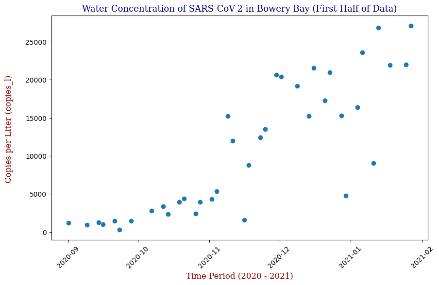
Below is one of the key visualizations from the project:
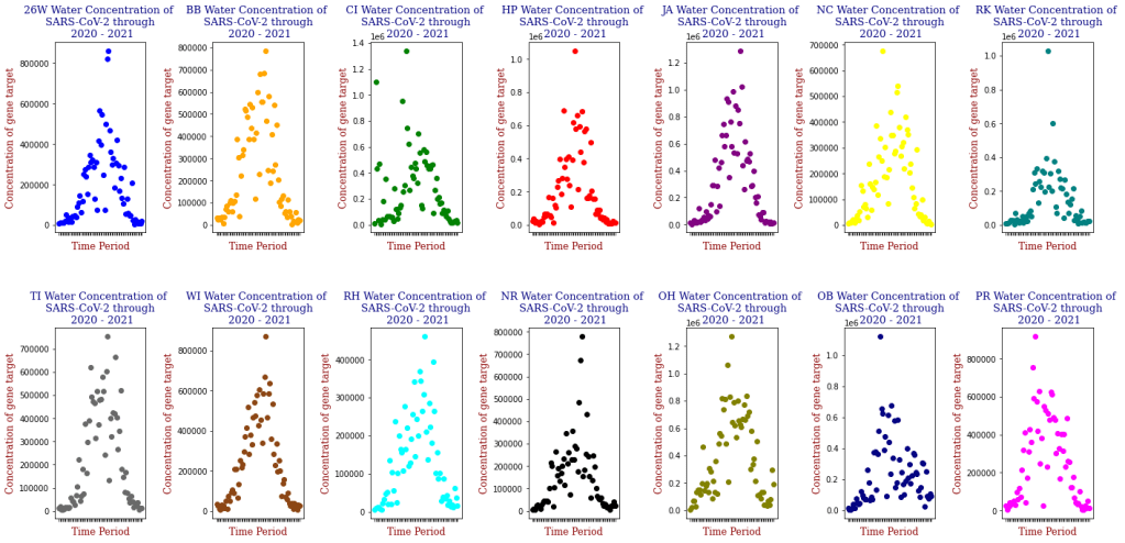
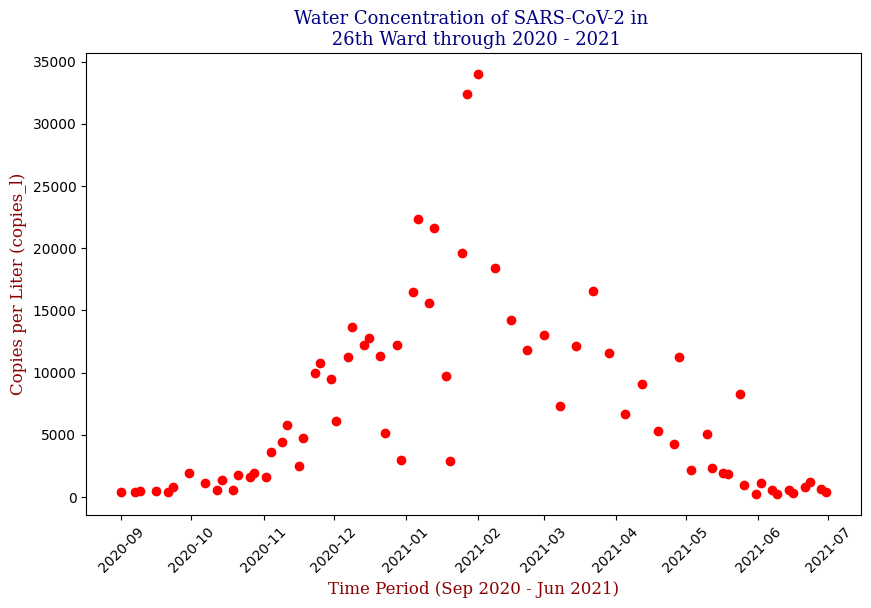


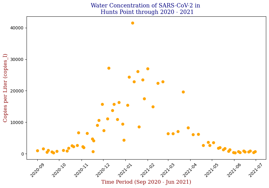
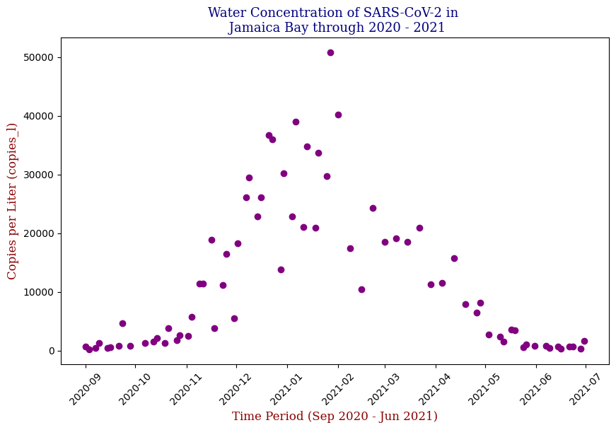


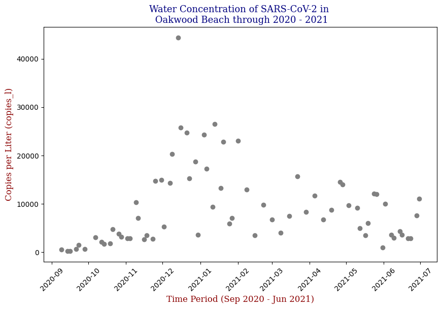
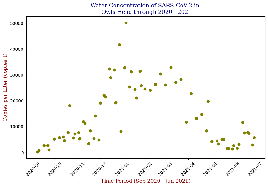
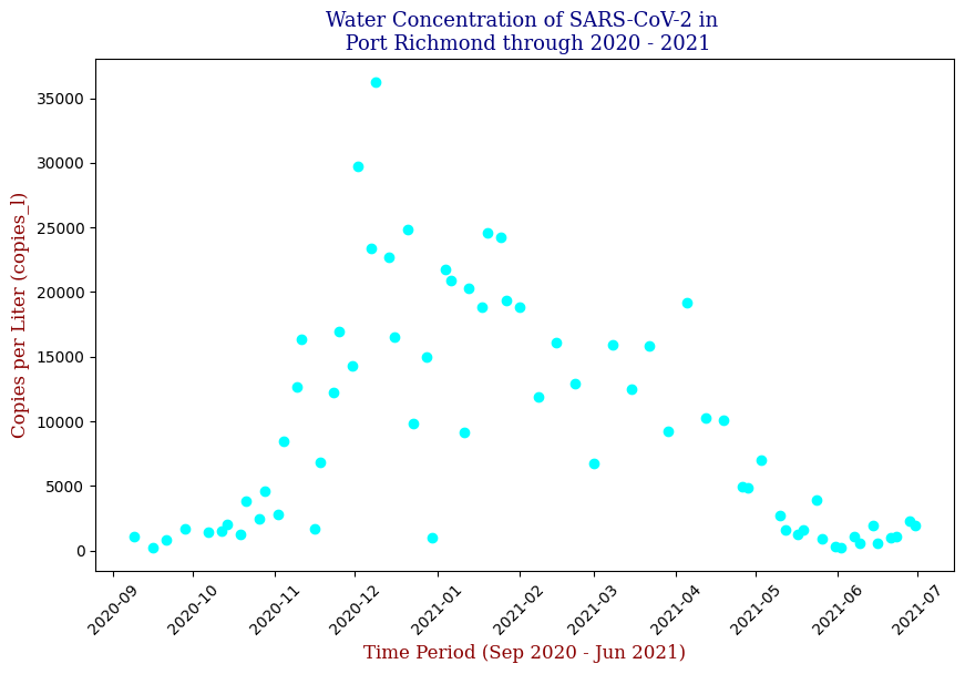

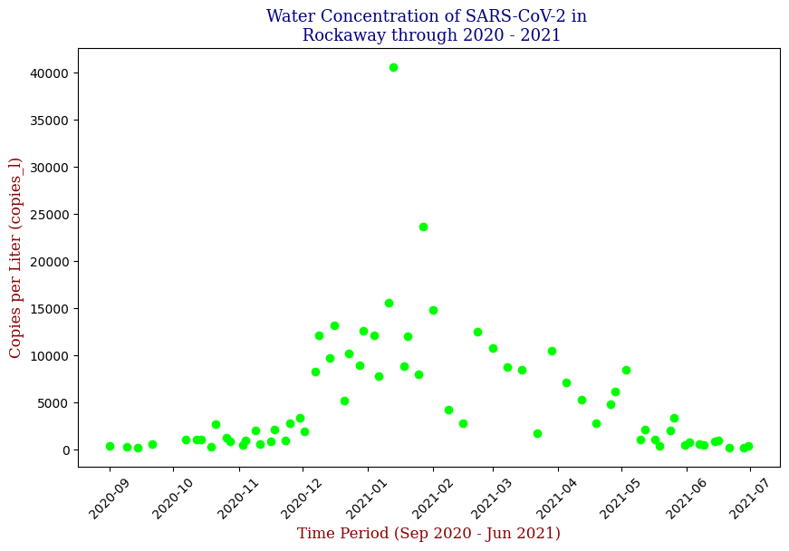
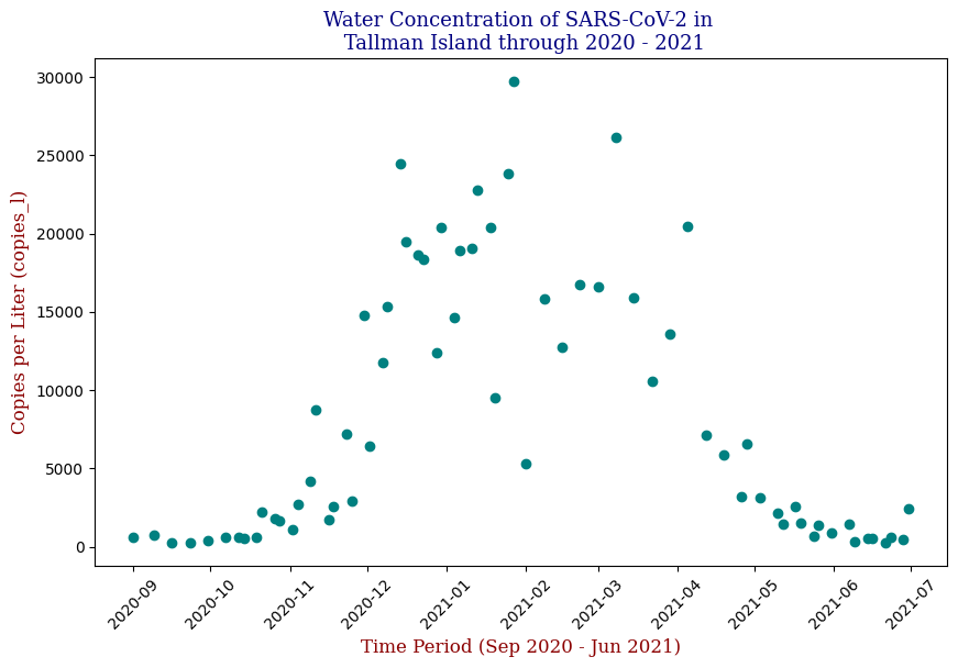
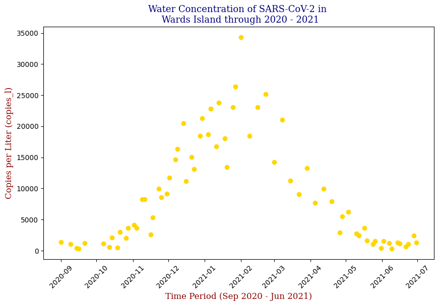
Here we have the 14 different sites where SARS-CoV-2 concentrations were measured, each with different data points but following the same trend from September of 2020 to June of 2021. Let’s focus on one of these graphs, in this case Bowery Bay (BB). Below we can see the following:
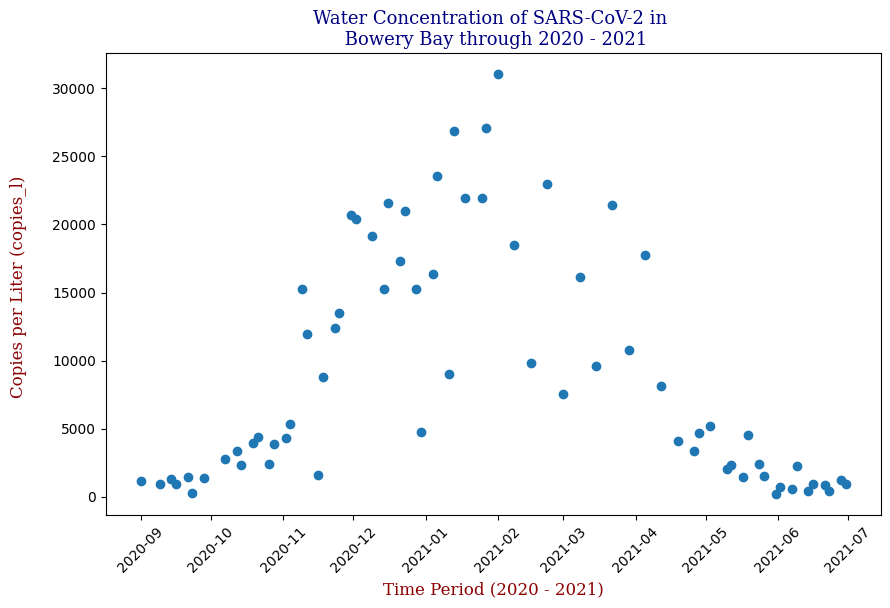
This plot illustrates the fluctuations in SARS-CoV-2 concentrations in wastewater over the study period, highlighting the significant peak and troughs corresponding to different phases of the pandemic. For the sake of the regression analysis, I will split the data in half, predicting the SARS-CoV-2 concentrations from the fall going into the winter (from September 2020 – February 2021).
Regressor Models Used and Evaluation
The core of the project was developing a predictive model using different models of Linear Regression. In this case, I implemented Stochastic Gradient Descent (SGD) Regression and Polynomial Regression.
Stochastic Gradient Descent
SGD is a popular optimization technique that updates the model parameters incrementally with each training example. We will use this over model for the benefit of optimizing the loss function. The following code snippet shows a general example of the implementation:
from sklearn.linear_model import SGDRegressor

# Initialize and train the model
SGDR = SGDRegressor(loss='squared_error', penalty=None, alpha=0.0001, max_iter=1e7, tol=1e-3, epsilon=0.1)

line = SGDR.fit(X_train, y_train, coef_init=.00025, intercept_init=10000)

print(SGDR.coef_, SGDR.intercept_)

y_set_to_use = [SGDR.coef_ * x + SGDR.intercept_ for x in X_train]

# Predictions
y_pred_sgd = SGDR.predict(X_test)
Linear Regression was used as a baseline model for comparison. The actual code snippet for the Linear Regression model is as follows:
Data Preparation
from sklearn.linear_model import SGDRegressor
from sklearn.model_selection import GridSearchCV
from sklearn.metrics import mean_squared_error, r2_score

# Set df equal to 'bb_20_21' which contains 'test_date' and 'copies_l' columns
df = bb_20_21

# Calculate the middle date
middle_date = df['test_date'].min() + (df['test_date'].max() - df['test_date'].min()) / 2

# Filter data to include only dates before the middle date
df_filtered = df[df['test_date'] <= middle_date]

# Prepare data for the filtered DataFrame
X = df_filtered[['test_date']].values
y = df_filtered['copies_l'].values
X = (X - X.min()) / np.timedelta64(1, 'D')  # Convert dates to numerical values
Automation of Parameter Optimization
Fine tuning the hyperparameters can be a time consuming, exhaustive process, so let’s automate this process using GridSearchCV, which systematically tries different combinations of hyperparameter values, evaluates them using cross-validation, and identifies which combination yields the best results.
# Define parameter grid for GridSearchCV, tinkering with the parameters for the SGDRegressor()
param_grid = {
    'loss': ['squared_error', 'huber'],
    'penalty': [None, 'l2', 'l1'],
    'alpha': [0.0001, 0.001, 0.01],
    'max_iter': [10000, 50000, 100000],
    'tol': [1e-3, 1e-4]
}

# Create and train the SGDRegressor model
SGDR = SGDRegressor()

# Initialize GridSearchCV
grid_search = GridSearchCV(estimator=SGDR, param_grid=param_grid, scoring='neg_mean_squared_error', cv=5)
grid_search.fit(X, y)

# Get best parameters and model
best_params = grid_search.best_params_
best_model = grid_search.best_estimator_

# Predict using the best model
y_pred = best_model.predict(X)
Model Evaluation
We will dive into Model Evaluation Later, but here is the code for it.
# Evaluate the model
mse = mean_squared_error(y, y_pred)
r2 = r2_score(y, y_pred)

# Print results
print("Best parameters found:", best_params)
print(best_model.coef_, best_model.intercept_) # Instead of (SGDR.coef_, SGDR.intercept_)
print("Mean Squared Error:", mse)
print("R-squared:", r2)
Visualization
# Display the linear regression plotted amongst the scatter plot
plt.figure(figsize=(10, 6))
plt.scatter(X, y, label='Actual Data')
plt.plot(X, y_pred, color='red', label='SGD Regression')
plt.title("Stochastic Gradient Descent Regression Model for Bowery Bay (First Half of Data)", fontdict=font1)
plt.xlabel("Time (Days since start)", fontdict=font2)
plt.ylabel("Copies_l", fontdict=font2)
plt.legend()
plt.show()
Which produces the following graph:
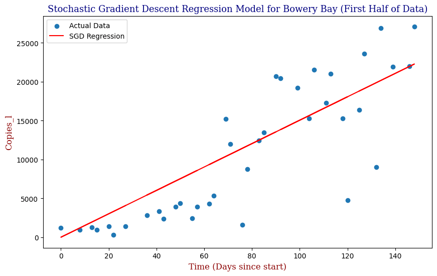
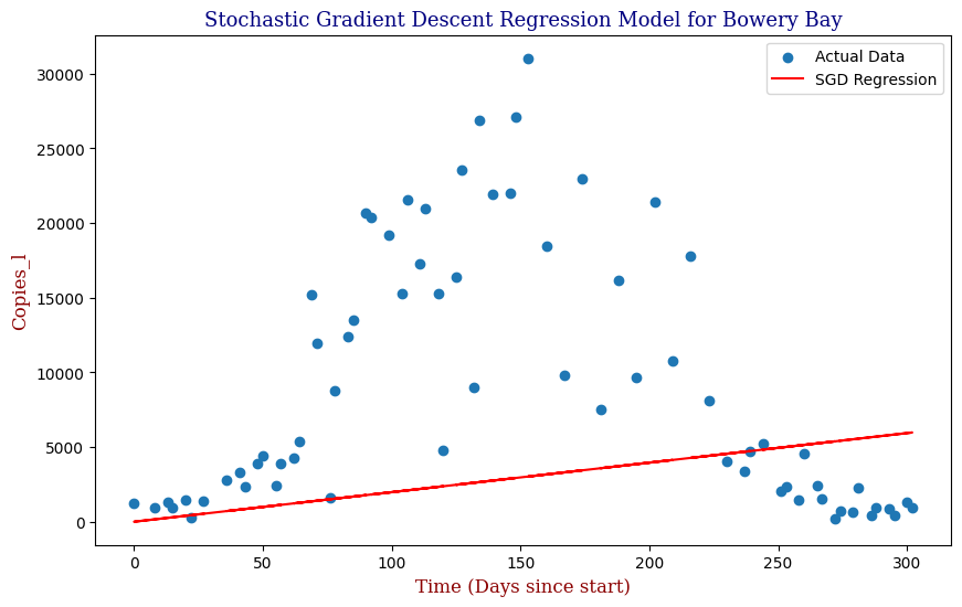
We see that our SGD Regression Line actually fits the first half of the data decently; however, if we were to utilize this regression with the full data, even with the parameter optimization, we can clearly see that our SGD regressor is limited as pictured in the second graph. For this, we need a better model. Let us explore Polynomial Regression.
Polynomial Regression
This modeling method can be applied to all 14 different locations where the genetic material for SARS-CoV-2 was measured to create predictions of SARS-CoV-2 concentrations throughout NYC. However, as these plots are inherently not linear, linear predictive models will, of course, not be the best method of predicting SARS-CoV-2 data points, unless we apply an extraordinary amount of SGD best-fit lines similar to how we would when taking derivatives. In this case, we could try an nth Order Polynomial Regression instead to create a more accurate representation. The Polynomial Regression can be expressed as follows:
y = ß0 + ß1x + ß2x2 + … + ßnxn
Where y is the dependent variable we want to predict, x is the feature or independent variable, ß0 is the y-intercept, the other ßs are the coefficients/parameters we’d like to find when we train our model on the available x and y values, & n is the degree of the polynomial.
In general, our code may be expressed as:
from sklearn.preprocessing import PolynomialFeatures
from sklearn.linear_model import LinearRegression

# Transform the features to polynomial features
poly = PolynomialFeatures(degree=2)  # Degree 2 for quadratic
X_poly = poly.fit_transform(X)

# Fit a Linear Regression model
model = LinearRegression()
model.fit(X_poly, y)

# Predict y values using the trained model
y_pred = model.predict(X_poly)
In code, our model was expressed as follows:
Data Preparation
from sklearn.preprocessing import PolynomialFeatures
from sklearn.pipeline import Pipeline
from sklearn.linear_model import LinearRegression

# Calculate the middle date
middle_date = df['test_date'].min() + (df['test_date'].max() - df['test_date'].min()) / 2

# Filter data to include only dates before the middle date
df_filtered = df[df['test_date'] <= middle_date]

# Prepare data for the filtered DataFrame
X = df_filtered[['test_date']].values
y = df_filtered['copies_l'].values
X = (X - X.min()) / np.timedelta64(1, 'D')  # Convert dates to numerical values
Automation of Parameter Optimization
We are still using GridSearchCV; however, we are now using Pipeline in tandem to transform the original features to polynomial features, and subsequently fit a linear model to onto those poly features.
# Define parameter grid for GridSearchCV, tinkering with the parameters for PolynomialFeatures() & LinearRegression()
param_grid = {
    'polynomialfeatures__degree': [1, 2, 3, 4, 5],  # Explore a wider range of degrees
    'linearregression__fit_intercept': [True, False]
}

# Create pipeline - which transforms original features to poly features and fits a linear model to poly features
poly_reg = Pipeline([
    ('polynomialfeatures', PolynomialFeatures()),
    ('linearregression', LinearRegression())
])

# Initialize GridSearchCV
grid_search = GridSearchCV(estimator=poly_reg, param_grid=param_grid, scoring='neg_mean_squared_error', cv=5)
grid_search.fit(X, y)

# Get best parameters and model
best_params = grid_search.best_params_
best_model = grid_search.best_estimator_

# Predict using the best model
y_pred = best_model.predict(X)
Model Evaluation & Visualization
# Evaluate the model
mse = mean_squared_error(y, y_pred)
r2 = r2_score(y, y_pred)

# Print results
print("Best parameters found:", best_params)
print("Mean Squared Error:", mse)
print("R-squared:", r2)

# Plot the results
plt.figure(figsize=(10, 6))
plt.scatter(X, y, label='Actual Data')

# Generate a smooth curve for plotting
X_range = np.linspace(X.min(), X.max(), 100).reshape(-1, 1)
y_pred_smooth = best_model.predict(X_range)
plt.plot(X_range, y_pred_smooth, color='red', label=f"Polynomial Regression (Degree {best_params['polynomialfeatures__degree']})")

plt.title("Polynomial Regression Model for Bowery Bay (Up to Middle Date)", fontdict=font1)
plt.xlabel("Time (Days since start)", fontdict=font2)
plt.ylabel("Copies_l", fontdict=font2)
plt.legend()
plt.show()
Which produces:
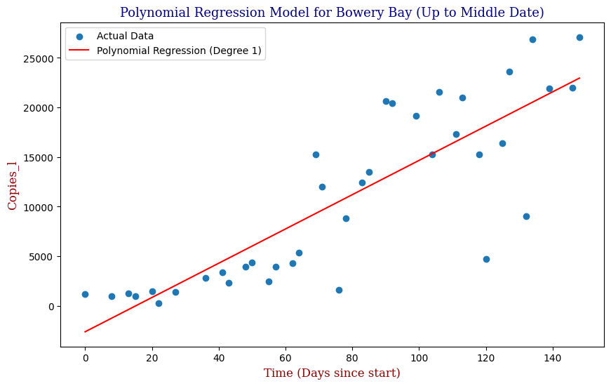
We can see that our Polynomial Regression yields a slightly better fit to the data. In this case, our GridSearchCV has determined that the Best Order Polynomial is in fact a 1st Order. Knowing however that we can utilize an exponential function to make predictions, let’s apply this to the full cycle from the beginning of September of 2020 to the end of June of 2021.
from sklearn.linear_model import Ridge
from sklearn.preprocessing import StandardScaler

# Prepare data
X = df[['test_date']].values
y = df['copies_l'].values
X = (X - X.min()) / np.timedelta64(1, 'D')  # Convert dates to numerical values

# Create pipeline with StandardScaler and Ridge
pipeline = Pipeline([
    ('scaler', StandardScaler()),
    ('polynomialfeatures', PolynomialFeatures()),
    ('ridge', Ridge())
])

# Define parameter grid for GridSearchCV
param_grid = {
    'polynomialfeatures__degree': [1, 2, 3, 4, 5],
    'ridge__alpha': [0.1, 1, 10, 100],
    'ridge__max_iter': [5000, 10000, 20000]
}

# Perform GridSearchCV
grid_search = GridSearchCV(estimator=pipeline, param_grid=param_grid, scoring='neg_mean_squared_error', cv=10)
grid_search.fit(X, y)

# Get best parameters and model
best_params = grid_search.best_params_
best_model = grid_search.best_estimator_

# Predict using the best model
y_pred = best_model.predict(X)
mse = mean_squared_error(y, y_pred)
r2 = r2_score(y, y_pred)

# Print results
print("Best parameters found:", best_params)
print("Mean Squared Error:", mse)
print("R-squared:", r2)

# Plot the results
plt.figure(figsize=(10, 6))
plt.scatter(X, y, label='Actual Data')
X_range = np.linspace(X.min(), X.max(), 100).reshape(-1, 1)
y_pred_best = best_model.predict(X_range)
plt.plot(X_range, y_pred_best, color='red', label=f"Polynomial Degree {best_params['polynomialfeatures__degree']}")
plt.title(f"Polynomial Regression with StandardScaler for Bowery Bay", fontdict=font1)
plt.xlabel("Time (Days since start)", fontdict=font2)
plt.ylabel("Copies_l", fontdict=font2)
plt.legend()
plt.show()
To avoid the possibility of overfitting, we will use an L2 Ridge Regularization penalty to constrain the size of the model parameters and use StandardScaler to preprocess and normalize the data.
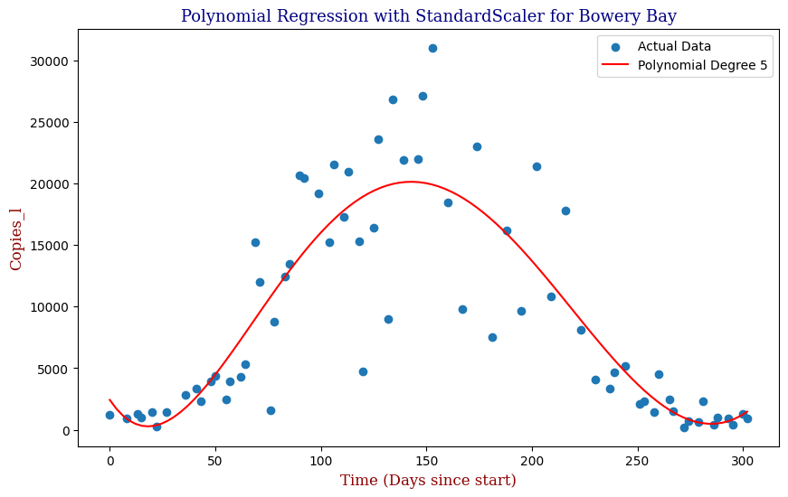
Here we can see that the model is able to adapt to the wave-like rise and fall of genetic copies, however is perhaps over influenced by the outlying data points towards the height of the winter.
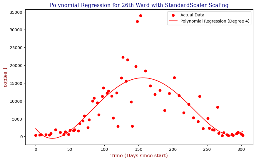
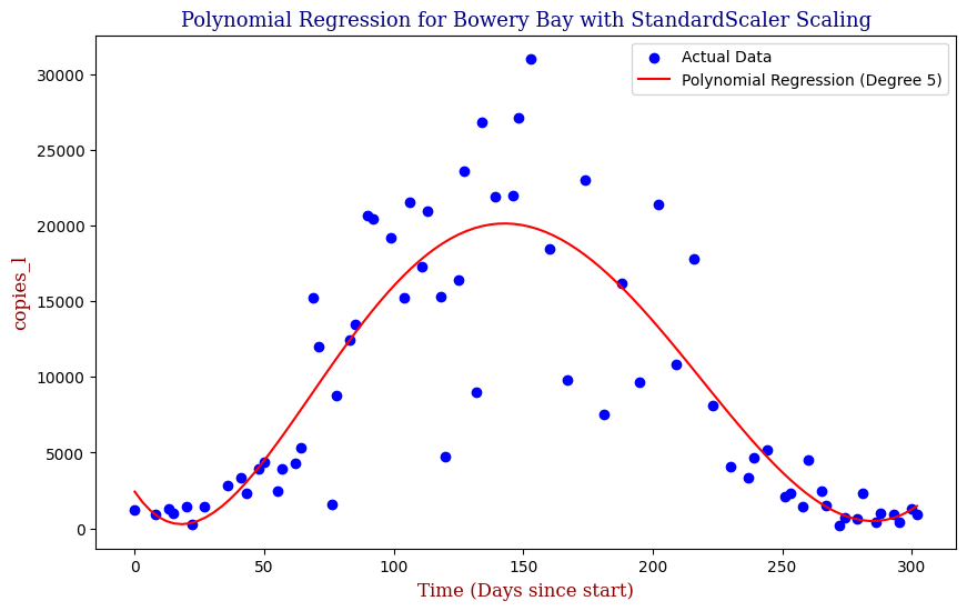
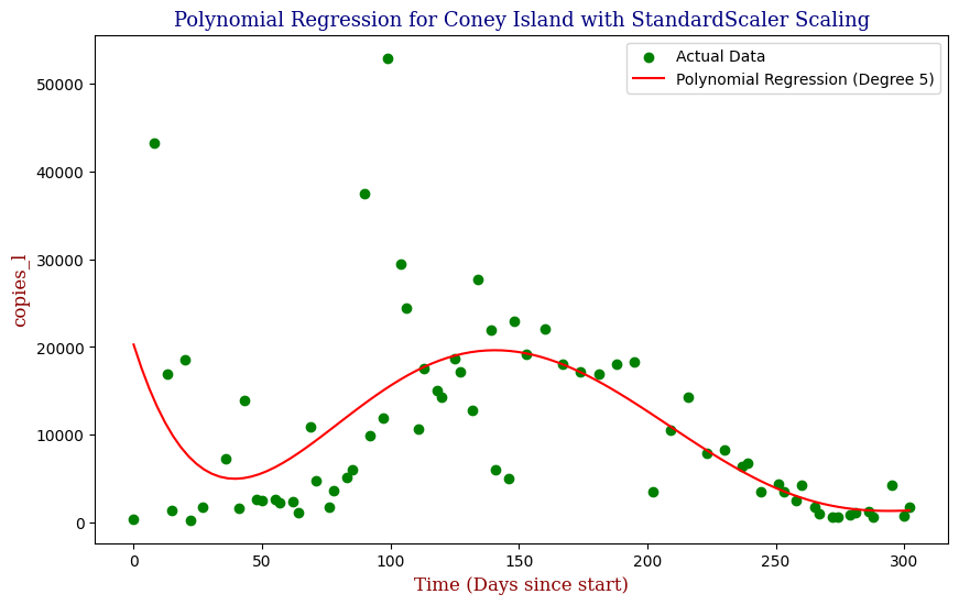
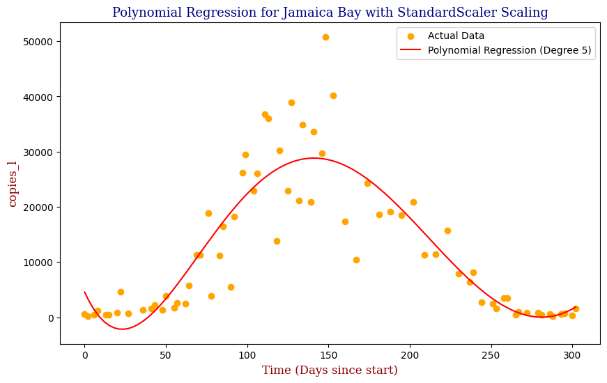
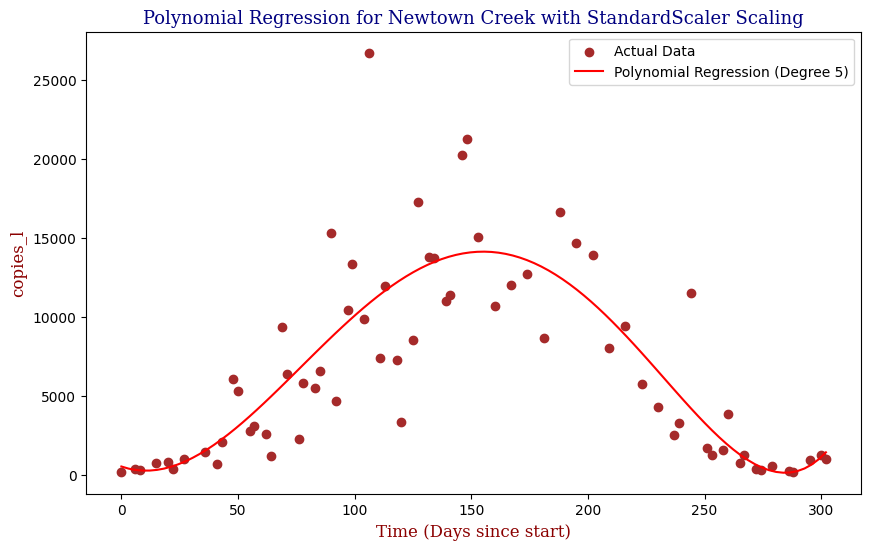
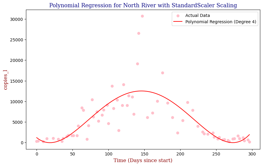
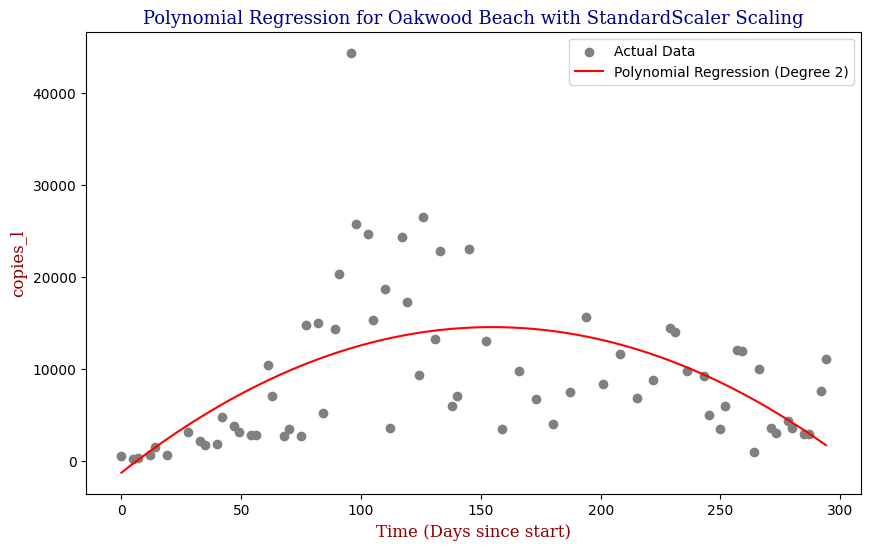
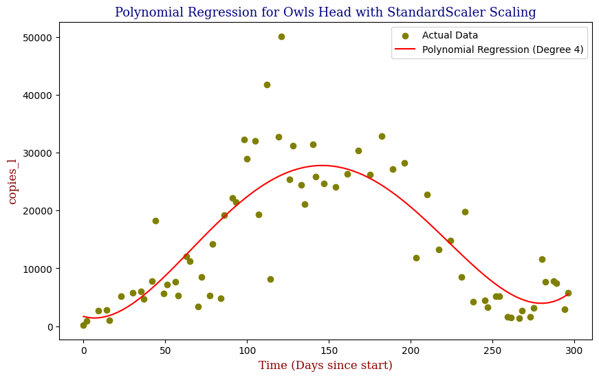
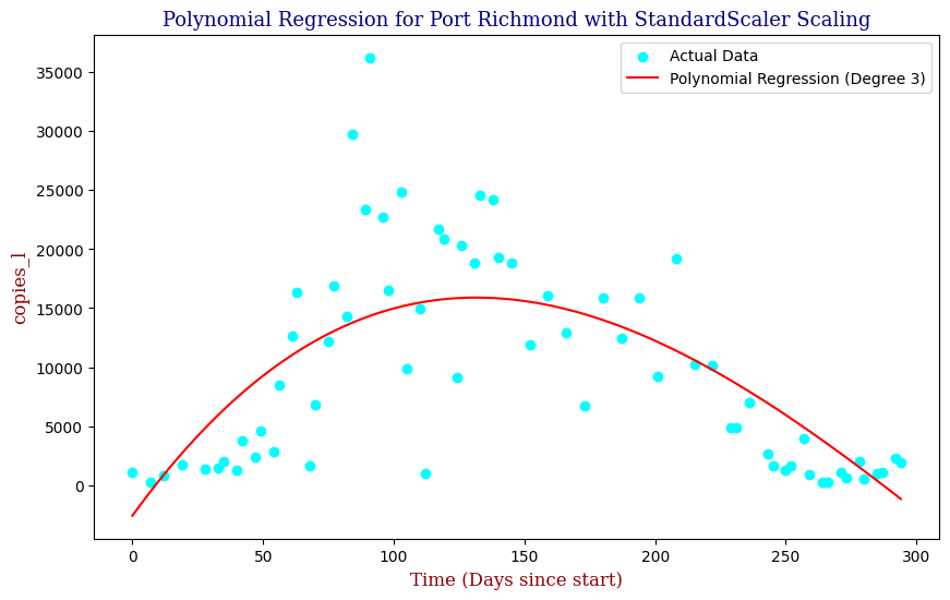
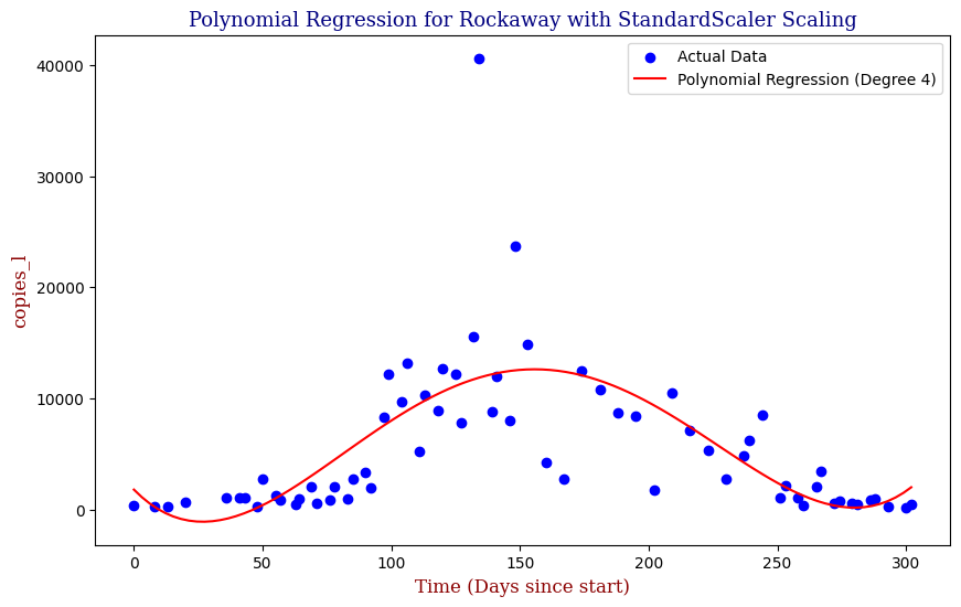
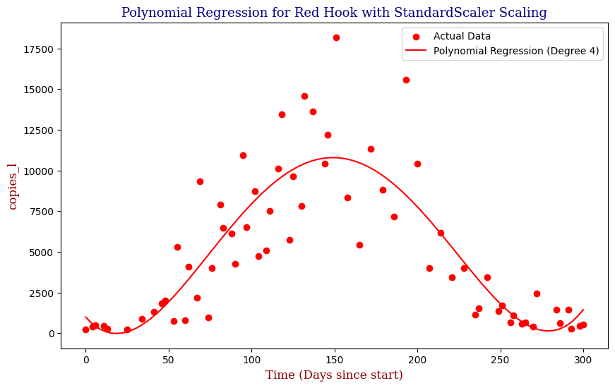
Polynomial Regression for all 14 Wastewater Resource Recovery Facility (WRRF) Testing Sites
Applying the same Polynomial Regression with automated parameter optimization, L2 Ridge Regularization, and StandardScaler preprocessing, let’s now apply our Regressor to all 14 WRRF Testing Sites.


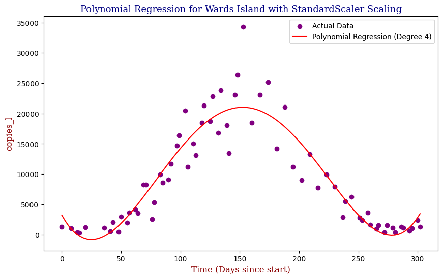
Model Evaluation
While visually, the fit seemed to improve when moving from Stochastic Gradient Descent to Polynomial Regression, how well did the models actually perform? Regarding the model evaluation, we can use metrics such as Mean Squared Error (MSE) and R-squared (R²). These metrics provide insight into how well the model performs and its predictive accuracy. The lower the MSE Score, the better. The closer the R2 Score is to 1, typically the better it is. A general code snippet example of this can be seen below.
from sklearn.metrics import mean_squared_error, r2_score

# Evaluate the SGD model
mse_sgd = mean_squared_error(y_test, y_pred_sgd)
r2_sgd = r2_score(y_test, y_pred_sgd)

# Evaluate the Polynomial Regression Model
mse_pr = mean_squared_error(y_test, y_pred_pr)
r2_pr = mean_squared_error(y_test, y_pred_pr)
For evaluation on the half time period, our Polynomial Regression model slightly outperforms our Stochastic Gradient Descent Model, boasting a R2 score of approximately 0.7175 as well as a lower Mean Squared Error score versus SGDR’s R2 score of approx. 0.6945. However, where it truly shines is in the full time period, where the Polynomial Regression boasted an R2 score of approx. 0.7490 versus SGDR’s poor R2 score of approx. -0.6071. we can apply it to the full period of time unlike the SGD Regressor. Proceeding to apply our Regularized Preprocessed Polynomial Regression Model to all 14 sites, we get the following metrics:
| WRRF Name | Best Degree | MSE | R2 Score | |
| 1 | 26th Ward | 4 | 1.904517e+07 | 0.656111 |
| 2 | Bowery Bay | 5 | 1.821593e+07 | 0.749047 |
| 3 | Coney Island | 5 | 7.179165e+07 | 0.366985 |
| 4 | Hunts Point | 4 | 2.623145e+07 | 0.666644 |
| 5 | Jamaica Bay | 5 | 3.385457e+07 | 0.786260 |
| 6 | Newtown Creek | 5 | 1.199273e+07 | 0.679206 |
| 7 | North River | 4 | 1.460849e+07 | 0.591942 |
| 8 | Oakwood Beach | 2 | 4.543060e+07 | 0.311155 |
| 9 | Owls Head | 4 | 4.007671e+07 | 0.705967 |
| 10 | Port Richmond | 3 | 3.352542e+07 | 0.566304 |
| 11 | Red Hook | 4 | 5.544685e+06 | 0.730302 |
| 12 | Rockaway | 4 | 2.206931e+07 | 0.498929 |
| 13 | Tallman Island | 4 | 1.619646e+07 | 0.765252 |
| 14 | Wards Island | 4 | 9.358533e+06 | 0.866843 |
The average Mean Squared Error was calculated to be approx. 26281551.2641, and the average R2 score was calculated to be approx. 0.6386. To improve upon the metrics, we can utilize increase the scope of parameter optimization so as to create a more accurate representation such as comparing RandomizedSearchCV with GridSearchCV, L1 Lasso with L2 Ridge penalties, and StandardScaler with MinMaxScaler and RobustScaler normalization techniques.
Conclusion
This project demonstrates the feasibility of using machine learning models, specifically linear regression, to predict SARS-CoV-2 concentrations in wastewater. The API built to process and manage the data, coupled with the helper functions and visualizations, provided a robust framework for this analysis. The results suggest that such models could be instrumental in public health surveillance, offering a proactive approach to monitoring viral spread.
By making this project open-source, I hope to contribute to the ongoing efforts in the fight against the COVID-19 pandemic and inspire further research into the applications of predictive modeling in public health.
For more details, including viewing the results of A/B Testing Lasso Polynomial Regression versus Random Forests Regression, the full project can be accessed here.

Leave a Reply